Mini Metro was a pleasing, inoffensive game about creating a public train system. Its sequel, Mini Motorways, could easily be described as “the same, except it’s cars.” There is, however, a murkier underside to the follow-up title, which develops a surprisingly effective satire.
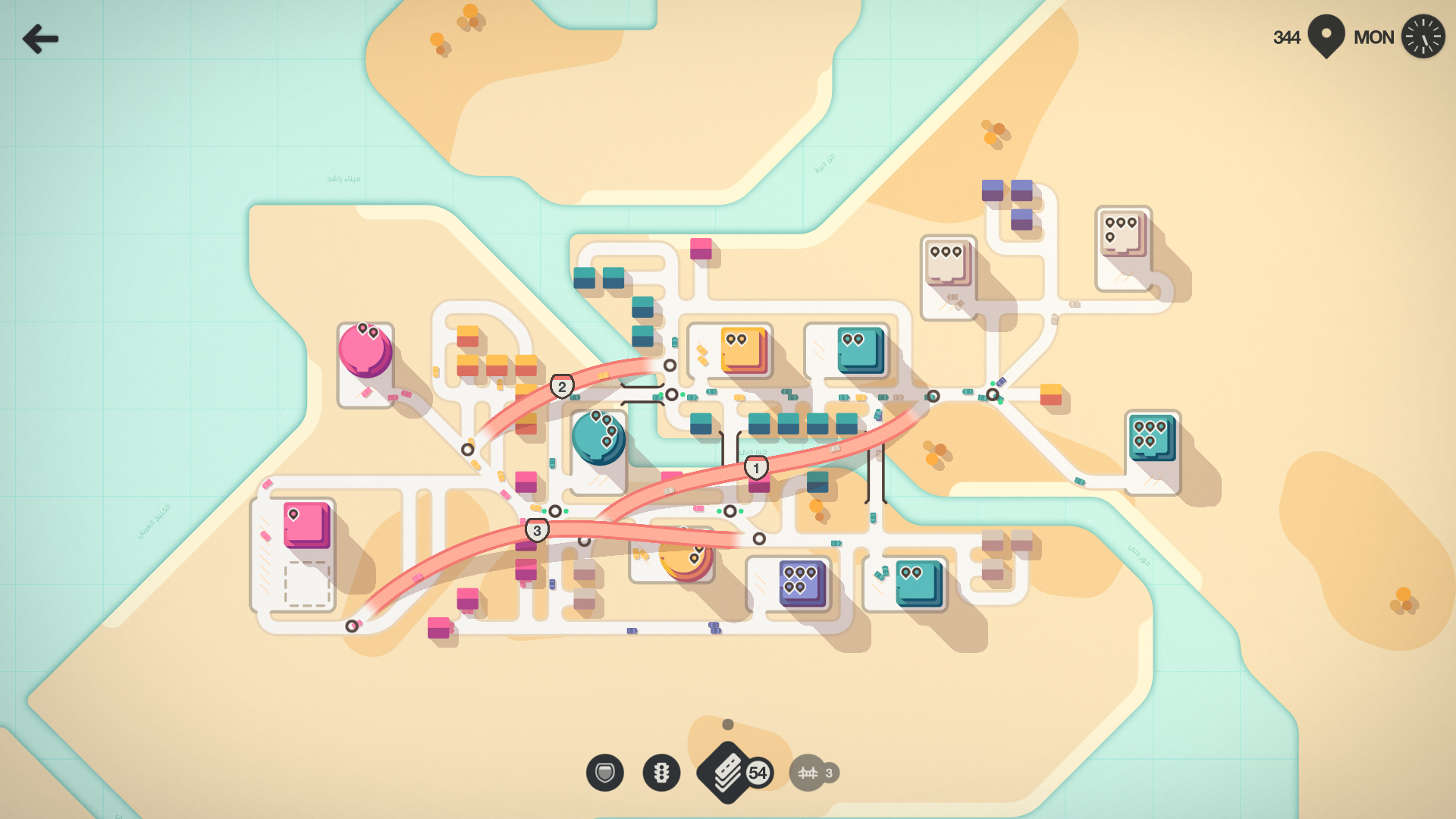
In Mini Motorways, you place road tiles to connect color-coded businesses with the homes of potential workers. It’s small and cute; abstracted versions of Tokyo or Los Angeles are presented in gentle color palettes; the map is peppered with tiny Monopoly-style houses. Everything connects to your roads which snap neatly onto an underlying grid as you place them.
Each run of Mini Motorways starts out simply, like one red office near two red houses. As your run continues and the city grows, more businesses appear, their needs growing greater as commuters jostle through congested traffic at crossroads. You pause time to reorder the city, neaten every road and feel some small satisfaction. Growth continues and things get more complex, more stressful. The car horns get louder. Eventually and inevitably your city fails, unable to keep pace with the appetite of capital. Motorways lie strewn across neighborhoods like spent ticker tape.
Mini Motorways has a lot in common with the maps used by tech companies on the most popular websites and apps. Often these businesses use a simple visual identity and chase the same accessibility and pleasing feel to their animations and design. They also share the same underlying urgency, addictiveness and dream of endless growth. Their enticing user experience provides a veneer over profitable capitalist techniques like extreme surveillance and the dehumanization of workers. Mini Motorways uses this design language in ways which highlight some of these more unpleasant implications.
There is the pin icon, as homogenized by Google Maps, a sure indication of something important, which here balloons over businesses when they need more player attention, more labor, a growing warning bubble near to bursting. The game’s tiny cars are like those of many delivery apps, identical to one another and all perfect workers; eager only to provide and earn. Houses are little more than garages where the cars idle in anticipation of the next job. Mini Motorways may start as a relaxing abstraction, but eventually players are pulled behind the curtain, asked to run an increasingly dystopian city for profit. The game lays bare this design trick of hiding function behind form, exploitation behind attractive interface.
Each location’s culture is irrelevant, its layout ever-changing, driven systematically to make more and more money. Your city is defined by roads, private business and individual cars, with no regard for anything public or shared. The public transit systems of the previous game have never seemed further away. The tactics of the game compound this, as the best strategies for getting a long lasting, high-scoring run are always the most antisocial. If you want to succeed you will segregate your neighborhoods by color, you will erect motorways across the whole city and you will destroy vegetation to squeeze every last meter of asphalt into the map. You will do it all to get those numbers higher and you will enjoy it. Although you may work to make your city aesthetically pleasant, ensuring it is a good city is another issue entirely.
You may look to other tactics to escape these implications. You can place random strands of disconnected road anywhere on the grid, as long as you have spare road tiles. Pointless shapes can be drawn, doodles on graph paper, the art of the disillusioned worker. A rejection of the neatness in this design, an element of purposeless defiance. Organized roads serving as paths of profit sit beside arcane squiggles, asphalt graffiti of unknown meaning. Like a disenfranchised spray-can painter, independent and anarchic. A mini rebellion. Then the city responds to these ill fitting shapes. The seemingly useless roads affect the system, corralling the larger buildings into different locations. This is, in fact, a popular advanced tactic, where odd road tiles are placed to manipulate the spawning of houses and businesses into more favorable locations. It turns out that expert Mini Motorways players never let a spare road tile languish unused, when it could be influencing the future of the city.
What had seemed like a subversion was simply a refinement, a deeper manipulation to serve the status-quo. Perhaps it was predictable, much as actual street art has become more commonly something calculated, co-opted and commissioned by those with money and power. Mini Motorways has once more made it clear that there is no escape, that within this system your design, your art, is useful only when it makes the numbers go up.


